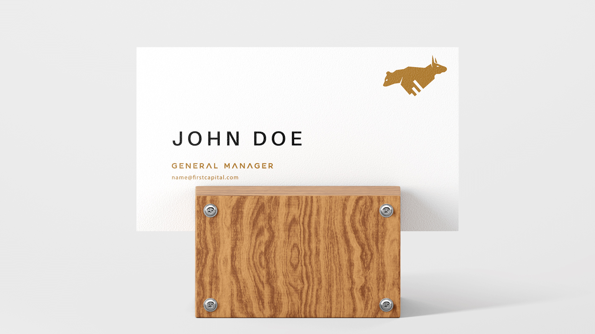
I chose sans serif typefaces for the logotype on this design, as the company was a new and modern presence on the stock market scene. I felt that a serif solution may come across as too dated for this project, and so a modern yet sophisticated sans serif choice made sense.